Monday, 1 November 2010

Dice Printing

  The prints below are very similar to my previous post. They communicate just how much range and versatility can be created with a very simple starting point. I think I prefer these over the previous Lego approach, mainly because of the more limited outcomes and also I like the ink colour used. The technique used was pretty much the same, running the items through a letterpress, and it makes me wonder if there was anything I could do that would be as successful. I will look into the letterpress idea and how I can combine with the Day of the Dead.


Lego Printing

Below is a piece of print that was recommended to me. The idea itself is very unique and the results work incredibly well. The designers; Samuel Cox and Justin LaRosa, used the smallest lego pieces available to arrange them into designs which where then ran through a letterpress. The objective was to create pieces of design inspired by early pixel art such as imagery you would find on 80's video games. By combining this with pastel colours, subtle pieces are created that the designers hope the purchasers will 'enjoy on the wall of your home, office, spacecraft, secret lair, or fallout bunker'. 


Friday, 15 October 2010

Siggi Eggertsson

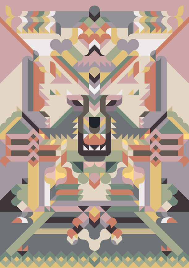
I found this artist called Siggi Eggertsson and saw instant links between his design and what I intend to do with 'Wrap it Up'. The use of simple vector images and colour to create incredible imagery that draws you in. Obviously the artist has used many colours, something I am not allowed to do, however it has given me an idea to use tints also, adding to the complexity. I really like the symmetry aspect also and think that if I can produce something just close to this I would be happy. Below is my favourite image of Siggi's, created to accompany one of his favourite childhood stories: Peter and the Wolf. Below that is another example of his work, this the front cover of a calendar.


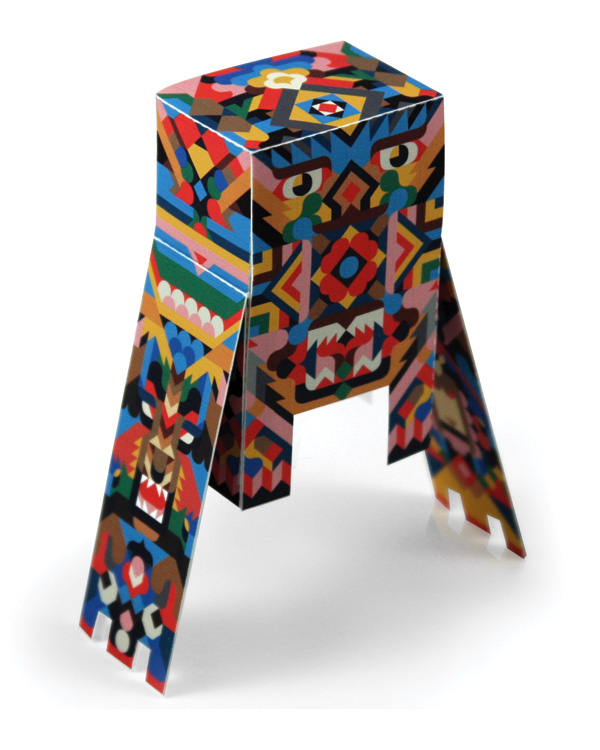
Below is another piece of his work that inspired me even more. If I could perhaps create an animal out of the packaging given to me I would be incredibly happy. Time to get cracking. If you would like to see more of Eggertsson's work click here.


Wednesday, 13 October 2010

7 Things About Print

InDesign Session: 13th Oct

Today was our third week with Mike in the computer suite. Previously we have explored Illustrator and Photoshop, meaning this week was the turn of InDesign. This particular programme is one of my least favourites so I was quite intrigued as to what I could learn, and if it would sway my preferences. Below are a few scans from my notebook in reference to key actions and processes which are essential to optimising use.


After learning about the initial set up menu and how to effectively create a new document we then went on to swatches. We have been taught about these in both other programmes and I guess now it was the turn of InDesign. Below is a screen shot showing the box that appears when you choose to add a new colour swatch from the drop down menu.


This image shows the options you will be faced with if you want to add a new tint swatch. This is one process that differs quite significantly to its photoshop or illustrator counterpart.


The image below just shows the effect of what duplicating an object can do. We were taught a handy little key board short cut that I found most useful: Apple, Alt & 4. This will copy your chosen object in exactly the same position that the one before it did. For example directly to the right or below, just like the image depicts.


Another useful process that we were taught today was how to separate the CMYK colours and in turn create four images that could be used for screen printing. Apparently this is also how it works in the commercial printing business. Below is the box that appears to help you see how much of each ink is required. In the image all the layers are selected, evident by the eye symbol, however by clicking a single line you can view a single colour. The box below also includes an additional colour, PANTONE Orange 021 U, which in this case is a spot colour.


This last image is of another useful skill in InDesign. It displays something called 'overprint' which means that when two colours are overlapped they reveal a third colour in the middle section. This proves useful when working with a limited colour palette and again is similar in style to screen printing.


Monday, 11 October 2010

Alebrije


Alebrijes are brightly colored Mexican folk art sculptures of fantastical creatures. The first alebrijes, along with use of the term, originated with Pedro Linares. After dreaming the creatures while sick in the 1930s, he began to create what he saw in cardboard and papier mache. His work caught the attention of a gallery owner in Cuernavaca and later, the artists Diego Rivera and Frida Kahlo. Linares was originally from San Antonio Arrazola, Oaxaca, and on family visits, demonstrated his designs there. The Oaxaca valley area already had a history of carving animal and other types of figures from wood, and Linares’ designs were adapted to the carving of a local wood called copal. 

The success of the craft, however, has led to the depletion of the native copal trees. Attempts to remedy this, with reforestation efforts and management of wild copal trees has only had limited success. The three towns most closely associated with alebrije production in Oaxaca have produced a number of notable artisans such as Manuel Jiménez, Jacobo Angeles, Martin Sandiego, Julia Fuentes and Miguel Sandiego.


Above is just a small example of the masses of different designs that are literally on the market. It is interesting because when I was in Mexico I didn't see any of these until I entered Oaxaca, where they were available in almost every shop. I purchased ones in the shape of an armadillo, a chicken and what must have been a mystical creature because it resembled nothing I had ever seen before.

Cookbook

To the left is the front cover of a Mexican cook book, detailing recipes from cocktails to desserts.

Review: This work concentrates heavily on recipes, formulas, and methods that would be available and easy to use for a domestic Mexican household of ordinary means. Reflecting the nineteenth-century linking of medicine and gastronomy, numerous items concern alimentation as it affects health, disease prevention, and treatment. One chapter, for example, is devoted entirely to preserving fresh foods for later use. Another chapter, “Higiene Domestica: Enfermedades mas comunes,” covers illnesses and their treatments. More than a mere cookbook, this manual also ventures into the area of manners and domestic economy.

Below are scans from a few pages of the cookbook. They are of decorative folk designs, and I think they are beautiful. I also think they will prove to be an inspiration for future design work.