Tuesday, 12 April 2011

Media/Processes

In terms of media and processes that I have actually used up to this point, the number is quite small. After all I am not privy to large scale printing and more complex processes. However I do have an interest in all areas and would love to explore them further in the future. Below are the five most appropriate example of media/processes that I could think of.

Example 01: Digital Print
This is my go-to method of production, predominantly because it is the most accessible but also produces some of the most pleasing results. I chose the particular example of digital print below because of the great quality images I could collect, and how it gives a process that can often times seem clinical and flat a much more textured look. The description of the outcome details that it is a two colour print on brown stock. This implies a connection to screen printing, but shows that you can create artwork that stands off the page with digital processes also. I also like the use of geometric shapes and how by printing on a stock other than the colour white you can produce some really visually appealing designs. So far within my own work I create textures using stock photography and Illustrator, perhaps this an approach I could take from now on to create a more authentic feel. 


Example 02: Screenprint
I chose this particular example in direct juxtaposition to the example above. Whereas the digital print above has more of a textured and imperfect feel, the screen print outcome below has an almost perfect like quality with crisp lines and an incredibly 2D look, something that is a positive in this case. I not only chose it because it is similar to the above example due to the use of minimal colours and a non white stock, but also because of the pop culture reference. In total there are three posters on display, each one summing up key visuals from the first three seasons of Showtime's popular drama 'Dexter' (coincidentally one of my favourite programmes). I like the last image in the list as it shows how these two specially mixed colours have been used to create such great compositions, and therefore communicates just how complex your design can be with such limited supplies. This happens to be one of my favourite pieces of current graphic design, and I know that I would love to create something similar in my own work in the future.


Example 03: Limited Editions
Limited editions are a perfect way of summing up the type of work that I wish to work on in the future. Below are pieces of Tyler Stout's work designed for the Coen Brothers cult classic 'The Big Lebowski'. I love the idea of creating work that is 'rare' and 'collectible' with people craving the purchase of new items due to their limited availability. That might sound like I'm interested in the money collected from the sale of items, but that couldn't be further from the truth. The thing that appeals to me is the thought of an audience being genuinely interested in my designs. After all I know what it's like to want a collectible piece that you can spend days tracking down only to discover there's none left, or the closest one is on the other side of the world. To think that people could one day do that in search of my work is an incredibly humbling feeling and one that I hope to experience one day. 


Example 04: Publishing
At this stage I began to struggle with ideas for the context of my work, then I came across the designs below. They are a great example of subtle design, incorporated with publishing and promotion and also screen printed finish. They are alternative front cover designs for the series of 'Hitchhikers Guide to the Galaxy' books. I love the use of negative space and retro inspired visuals, but most importantly what I love is the use of a different medium. Book design is something I had never considered, but when you think about it in terms of my other interests, which include film, TV and theatre, it fits in nicely. It's just another way of incorporating pop culture references and definitely something I will consider from now on.


Example 05: Editorial
Similar to the previous post, only slightly less illustrative and more type orientated. After attending my type elective sessions for the past few months I have gained a new respect for the subject matter, and have discovered that I actually like working with grids and text to create successful layouts. The example below combines my interest in type layout and the use of bold colours. From the looks of things this example has also been produced using traditional methods such as screen printing, another area of interest of mine. What I like about this particular example is the clever use of columns, imagery and sub headings, and I think given the opportunity I would have created something similar. 


Specialisms/Skills

When I think about my skills and the things I might one day want to specialise in I'm pretty set in my ways. I know the things that I'm good at, but more importantly I know the things that I am not good at. I am also aware of the areas which I find more interesting and the areas I know I will never want to explore further. However well I know myself, I still found it difficult to think of five examples of my specialities. Below are the first five things that came into my head, meaning hopefully the most important five things to me.


Example 01: Colour
Colour is important to me, it keeps things light hearted and non serious. Below is a fantastic example of the use of bright colours and editorial design. The brochures which where created for Nottingham Trent University's graduate show combine a beautiful font choice with bold variations of the primary colours; red, yellow and blue. Colour can be used in so many ways; as the predominant colour like below or as a highlight when working with black and white or more muted tones. I personally think I prefer it when used as a highlight, that way it's not so overwhelming and more subtle. I also like the use of different colours rather than the ones shown below, pastels for example.


Example 02: Vector Imagery
Illustrator is my favourite programme and ever since I discovered how to work the pen tool I haven't looked back. Since making the discovery I have also developed a new found respect for artists who use it predominantly within their work. Siggi Eggertsson is an artist who uses clean, vectorised imagery and pastel colours to create incredibly complex and often times intricate pieces of design. Below is just one example of his work although it does display his many talents, talents that I one day hope to emulate. The only thing that I don't feel corresponds to my work is his tendency to create images that appear pixelated, this is something I am not interested in. As I said previously, now I know what goes in to working with Illustrator I can appreciate Siggi's work even more and the amount of time he spent on the piece below must be staggering. It is my responsibility to keep working on my skills in order to become as efficient on the programme as possible. 


Example 03: Type and Composition
Working with Graham in my type elective has taught me that I may have an inherent skill in editorial design and working with type layout. Even though I have found the tasks challenging I also consider the things that we have been taught to be things of general knowledge. For example using the right font choices and sizes, a simple grid and not making images too focal are all elements of editorial design that I knew before the sessions. Below is a small excerpt from an Italian magazine. I chose this particular article because I liked the subject matter and the colours, combined with the layout of the body copy, I found it a great piece of design that I could relate to. 


Example 04: Packaging
One area in particular that I feel passions towards is packaging. Whether it be extravagant and large scale or smaller and more basic I am interested in all areas. If I had to pick one specialism right now that I could only do for the rest of my career I'm pretty confident it would be packaging. If I could just combine it with pop culture then it would be perfect! I chose the example below because of a few reasons: the interesting print processes, the retro inspired visuals, the choice of stock and the intricate interior design. I also like the colour choices and the textures created using what I'm guessing is Illustrator. I love working with my hands; cutting, folding, gluing, they're all things that I enjoy and could happily continue to do until the day I die, and with inspiration coming from the example below I don't think I'll have any trouble continuing to design. 


Example 05: Hand Rendered Type
Mike Perry is an incredibly well known designer, most commonly known for his hand rendered type. Below is just one example of his efforts, one of my current favourites. From the simplistic combination of black strokes and bold blocks of colour to the use of negative space, it just seems to work incredibly well. As well as my interest in laying out computerised type and editorial design I also like to dabble in hand rendered type and more experimental design. I like how in the example below it manages to be both restrained and quite zany, an approach that I like to incorporate in my own work.

Monday, 11 April 2011

Audiences/Contexts

Because the work I have created up until now has only ever been for college briefs I have never really considered the context of my creations in great detail. It is perhaps something I should give greater thought to in the future, but in the meantime I have had to think of five examples of audiences and contexts that I think I would be interested in, in the future.

Example 01: Large Scale Promotion
The images below show a range of different contexts for promotional work for a basketball tournament held in New York. Due to the location of the tournament the placement of the advertising has to be strategic. Therefore the designs have been placed in a selection of locations in a range of formats including: large scale billboards in built up areas and smaller scale posters in select subway stations. Even though the subject matter is not necessarily something I would be interested in, the visual choices engaged me and perhaps therefore engaged other people within the public who might not necessarily be interested in this sort of thing. This particular example is a bit of a pipe dream at the moment and I'm not sure if I'll ever have the opportunity to procure such a large scale promotional brief, however I'm not sure I would even want to if it meant working in an area I have no interest in. 


Example 02: Playful and Inanimate 
I'm not sure if this really fits into this category, but I wish to mention it nonetheless. In terms of an ideal audience I have always wanted to design for a younger market who are not against spending money on frivolous purchases, or in other words; myself. There are a lot of products out there which serve no real purpose other than to entertain an audience and provide engaging visuals. A prime example of this is the one below; 'plushies'. A somewhat new craze where designers, companies, shops etc. design there own toys and teddies around pointless and quite often weird illustrations. The particular example below have been created by the designer Tad Carpenter, a new found favourite of mine, and it just goes to show no matter how accomplished you are, you're never too successful to create a set of silly toys for anyone who wants to buy one.


Example 03: Everyday Objects/ Stationery
Some of my favourite shops on the high street are ones that sell graphic design in stranger and more intriguing mediums, MAGMA for example. They specialise in selling graphic products to a particular subset of students/young adults interested in parting with quite a large sum of their money for a silly and often pointless purchase. This is perfect! The examples below are just a small collection of what you would find for sale in MAGMA, the shop that I would love to have a product in one day. As you can see the products usually involve bold, attractive illustrations placed on everyday items such as plates and cups. This is an area I would love to explore further, perhaps even in the next project.


Example 04: People who Understand Pop Culture References
The one quality that I look for in the audience of my graphic design is that they understand a large array of popular culture references. Due to my interest in such a vast range of film, TV, music, theatre, books and other various trends I understand a wide range of references and 'inside jokes' if you will, but I fear that the people looking at my work won't. Below is a perfect example of the point I am trying to make. It is a piece of self directed design from Andrew Kolb that takes such a huge phenomenon in the recent music scene, Lady Gaga's 'Telephone', and combines with his style of design to create a piece of well crafted but subtle piece. When I first discovered this interpretation I was blown away by the cleverness, and then just dumbfounded by the actual design and aesthetic value. It's a perfect example of what I am interested in and would love to create in my career.


Example 05: Alamo Drafthouse
This last example is a particular context that I have always been keen to explore further. The Alamo Drafthouse is a chain of cinema's found in nine locations across America. In terms of general purposes it is a cinema that shows all the latest releases, however on a more specific note they hold a lot of more specialised events such as the 'Rolling Roadshow'. This is one night a year when original 35mm screenings of films such as The Lost Boys and The Shining are shown in famous locations. However it is not the events themselves that interest me, it is the poster artwork that are created for the events that I admire and would love to create something for one day.


Products/Outcomes

There are hundreds of possible outcomes and products that could be created using my approach to graphic design. Below are just five examples of specific graphic design that I could find that relate to both my interests in subject/content and end products/outcomes.


Example 01: SNL Game
This is a great example of a brief that I would loved to have undertaken. A board game created around the classic American comedy sketch show; Saturday Night Live. I love everything about this product; the content itself and the items that are depicted, to the bright and attractive colour and design to the fact that it is actually a piece of packaging, one of my key areas of interest. I adore the use of hand rendered type and think that it is the perfect choice for the often unhinged and scatty programme. I also like the amount of type that is used, it helps to indicate the large amount of dialogue used in the programme and the bright yellow colour also implies further the zany sense of humour that is often on display.


Example 02: Wooden Toy Quarterly Magazine
Wooden Toy Quarterly is another example of how I could combine all my interests ranging from image and type combination to editorial design and publishing processes to create a rich and colourful magazine. This particular magazine is created by Timba Smits, another new favourite designer of mine, who takes a theme and bases a complete issue around it, in this case music. I have a copy of this issue and am amazed at the range of topics covered and the visuals put to use. It really is a great example of how something can appear so playful yet completely professional.


Example 03: Vinyl Toys
This is just another example of a product/outcome that doesn't fit within the realms of traditional flat graphic design, but instead takes the illustrative approach and combines it with 3D design. In this case I have chosen the vinyl toys called 'Qee Bears' and shown how bright and intricate the characters can be. I'm not sure if I could ever create a design that is so bold and attractive, but I can certainly appreciate the effort put in and how the idea chooses to expand further than the original constraints of 'traditional graphic design'. 


Example 04: Interactive and Practical
This fourth example is a perfect showcase of how you don't necessarily need strong and unique visuals but can have great success with a strong and unique idea. This case study takes the idea of your traditional sticky note or 'post-it' and puts a modern day twist on it by turning it into a floppy disc design. It is practical yet creative, the genre of design that I have always been interested in and would love to explore with my own creations. I also like the use of retro visuals such as floppy discs and cassettes in contemporary design, with this being just one example.


Example 05: Scotty Reifsnyder 'The Man Who Couldn't Cry'
This last example is very interesting as it details such an intriguing list of final outcomes/products. Scotty Reifsnyder took a simple subject matter ; Johnny Cash's 'The Man Who Couldn't Cry' song, and turned it into two wholly separate but both effective outcomes. The first thing he did was create an animation. Now I know what I have said in the past, and that I promised I would never work with aftereffects or moving image again as it is too stressful, however after watching this video I have had my faith restored. It is the type of animation that doesn't seem so challenging and with the right assets works incredibly well. The second outcome for this project was to take the illustrations and turn the concept into a childrens book. I really like this as it again combines pop culture references with a unique solution, my ideal approach. 


Subject/Content

When it comes to choosing a subject for my own graphic design work I always seem to find myself drawn to anything that references popular culture. This can range from television and film, to music and the theatre. I often want to create pieces of work that act as support for the previously mentioned content,  whether that work be promotion, packaging or simply a celebration of the subjects popularity and/or success. I like for my work to be light hearted, however if the subject matter calls for it I can also be more serious with heavier undertones. Below are the five best examples I could find that best depict my interests in subject matter and content.

Example 01: Ferris Bueller Board Game
This is a great example of design created for film. It isn't your regular re-imagination of a film poster created by the likes of Tyler Stout and Olly Moss, it goes one step further and takes the concept of this cult favourite and uses it as the driving force behind an inventive product/outcome; a board game. Besides from from the concept itself I also have a fondness for the visual style used and the retro approach. After constantly researching work such as this I have noticed certain trends and how some films are more commonly used as inspiration than others. For example cult films are often the ones to be reimagined and it is rare that popular cinema is referenced. However in the case of more accomplished designers modern movies are often used as inspiration.


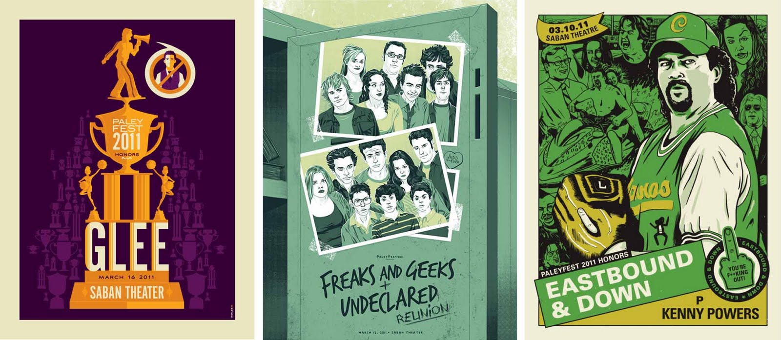
Example 02: Paleyfest Posters
Paleyfest is an annual convention when the cast and crew of popular TV programmes gather to answer questions from the press and fans alike. I guess it's in the same vain as the ever popular 'Comic Con', just not as well known and of course not as 'nerdy'. This year some of the programmes decided to enlist the help of some well known designers such as Mike Mitchell and Derek Deal, to create the promotional material for the events. Below are a few examples of the posters and I absolutely adore every one of them. This could possibly have something to do with the fact that I am a fan of every one of the shows, or it could be that the designs themselves are just so well executed. My particular favourite would have to be the Parks & Recreation interpretation by Mike Mitchell as it just so perfectly sums up the roles of the characters in a single frame whilst remaining visually stunning. He was born ready... he's Ron Swanson!


Example 03: Playbills
Playbills are the perfect form of design in relation to the theatre. Below are a few images of past playbills and how they are successful when it comes to creating one single visual image that sums of the entirety of what can often be quite a complex play/musical. Again this particular subject matter is very close to my heart and I think it is an area that has not been fully explored by a lot of designers. I would love to delve further into the field and if given the opportunity to design something for the theatre I would jump at the chance. I tried finding out the designers to some particular favourites of mine including 'Wicked' and 'Rent' but it seems as though it is hard information to find, and they could be perhaps one off designs.


Example 04: Lee Crutchley Work
Lee Crutchley is the perfect example of a current graphic designer who takes pop culture references and combines them with his unique 'felt tip' style to create visually engaging pieces. Below is the best example of his work that I could find. He has taken the current spiraling of Charlie Sheen, a subject matter that is rife with genuine humour, and mixed it with the visuals usually found as promotional work for HBO's 'True Blood'. I laughed at the image because I understood it, the other people laughed are the people I want to design for.


Example 05: Tyler Stout Film Posters
Last, but by no means least, are the posters of Tyler Stout. This right here is the designer who I wish I could be. The way he works, the briefs he picks and his visual approach are just perfect to me. If I could sum up what Tyler Stout means to me in just one word; inspirational.