Original
 Tyler Stout
 Tom Whalen
 Tyler StoutTom Whalen
 Berlin based illustrator Frauenwahl's style remids me of old school comic books. How he uses just black and white, but creates these creepy pieces is quite a talent. His work is almost a throwback to black and white horror movies of the fifties, like 'It Came From Beneath the Sea' or 'Them!'. For example when I look at the piece below I can't help but think of 'The Blob'. I can remember another example of this type of illustration from a few years back when I read a comic called 'The Man with the Screaming Brain'. The whole story read like B-Movie plot, but the pencil and ink work was fantastic.
 Rick Remender


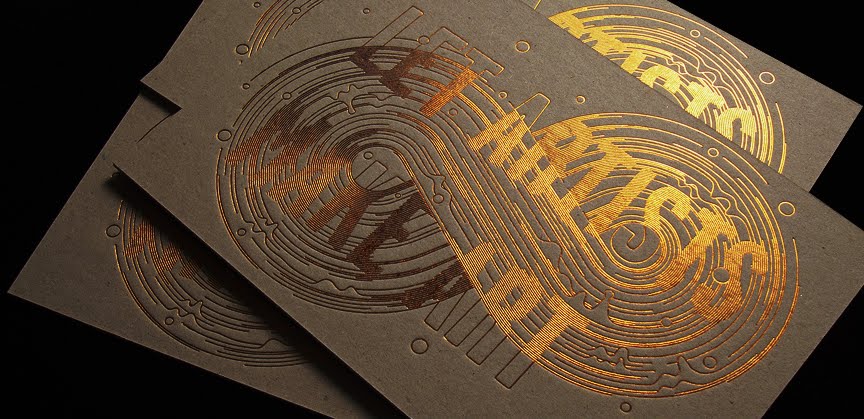
 I really like this illustration but don't actually know why. I think the fact that the artist originates from Hong Kong really explains the feeling I get when looking at his work. The brown stock he has used adds texture to the piece, whilst the warm colours he has used, including oranges and browns, adds a non formal feeling to the piece. Which I think is important for this particular brief, because advertisments for banks can often seem clinical and impersonal.
 Knowing that illustrator Lisa Hanawalt is based in Los Angeles definately gives her work depth. This piece features half human, half animal creations in a distinctly human scenario. The mix mash of colours and patterns helps add to the absurd atmosphere and reflects the hectic lifestyle of many people in the modern day world. Apparently the use of animals with humans is meant to reflect the large contrast between the nobility of the former and the ugliness of the latter.
 Mario Hugo is a New York based Illustrator and designer. The work above was designed for an exhibition which had a big figure eight skate ramp featured heavily. Therefore the design he chose to go with obviously runs with that theme. The shape of the imprint on the front of the invitation mimics the smooth curves of skate ramp, whilst also reminding me of the shape of skate wheels. This is also aided by the fact that there are two circular shapes and the wavering lines. I also think the colour and stock he chose to use heavily represent the mechanical and urban side of skateboarding.


 All of the above were designed for Beck album covers. After looking at all of them its clear that the outline Mario was set was to create anything, aslong as it suggested bold and outgoing. The first example is probably the most representative of this, with wood blocks being used, one of the strongest natural materials in the modern world, nothings suggests strength more than this. The second is in the same vain, however this time the boldness is portrayed by using a simple black and white colour scheme and choosing a typeface that has heavy strokes. The other two again somehow represent boldness, although I'm not so sure how.


 I stumbled across this poster and was instantly struck by its simplicity. Its very similar to what we where asked to create for our 'No News is Good News' poster project. By deciding to keep the poster completely devoid of type, it becomes instantly more intriguing. The viewer is drawn in an asked to come up with their own individual interpretation. Personally I don't know what the message is, probably becauase I don't know what the symbol on the right represents, but I definitely want to find out.
 This is another piece of his that I liked. Most probably because of the interesting way in which he compares surgery to the mechanics of engineering.
 This is probably his most well known piece, featuring a projectile heading towards, instead of away from, a cannon. The colour scheme is kept very minimal and the message clear. This is a very good example of how a message can be communicated without the need for a great deal of information. From this incredibly simple poster I get the idea that he thought war was pointless and 'Victory' is always bittersweet.
 This is a dish cloth designed by Swedish artist Maria Holmer Dahlgren. It is one of a series that were 'London Inspired'. I like it because the message is incredible clear from the very first moment you look at it, and the phrase' Its raining cats and dogs' is also very appropriate to the weather in the UK, particularly London. The colour scheme is kept minimalist and the design concise, and even though the animals are solid black, the positions which they are in help to communicate the right idea.
 This is another from the series. Instead of interpreting a well known phrase this time the designer has interpreted well known buildings and situations from the capital. I feel it works just as well.


