
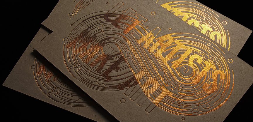
 Mario Hugo is a New York based Illustrator and designer. The work above was designed for an exhibition which had a big figure eight skate ramp featured heavily. Therefore the design he chose to go with obviously runs with that theme. The shape of the imprint on the front of the invitation mimics the smooth curves of skate ramp, whilst also reminding me of the shape of skate wheels. This is also aided by the fact that there are two circular shapes and the wavering lines. I also think the colour and stock he chose to use heavily represent the mechanical and urban side of skateboarding.


 All of the above were designed for Beck album covers. After looking at all of them its clear that the outline Mario was set was to create anything, aslong as it suggested bold and outgoing. The first example is probably the most representative of this, with wood blocks being used, one of the strongest natural materials in the modern world, nothings suggests strength more than this. The second is in the same vain, however this time the boldness is portrayed by using a simple black and white colour scheme and choosing a typeface that has heavy strokes. The other two again somehow represent boldness, although I'm not so sure how.
No comments:
Post a Comment