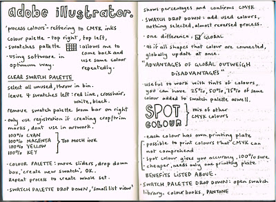
I have to admit that I went into this session a bit skeptical. I thought that I knew pretty much everything there was to know about Illustrator. After practicing on it for the entire first year it seemed as though I had come on leaps and bounds with the programme. However sitting through this first tutorial taught me that there is still a large amount to learn. We were told how to create personalised swatch palettes for any future design work. I have come to realise that it will be incredibly useful in the future and will really come in handy when I am juggling more than one brief at a time. It will allow me to open my desired colour palette and get on with my work. I took notes throughout the tutorial and followed along with the process at the same time. I jotted down some things that I thought were particularly important and could come in handy when communicating with printers in the future.
- Registration Swatch: only use for crop and alignment marks, never use to colour artwork. The main reason for this is because it is a mix of 100% cyan, 100% magenta, 100% yellow and 100% key black. There will be far too much ink on the page.
- Global: This is a small tick box that is found when adding a new swatch. When selected it's as if all the objects using the same colour are connected and therefore universally update.
- Spot Colour: A mix of other colours; when each individual colour has its own printing plate. Advantages include better accuracy, cheaper costs and creating colours that are not available in CMYK mode.
- Pantone: A library of colours found within the 'colour books' section of the swatch palette drop down menu. Available to pick a variety of coated, uncoated, matte etc. and move to specialised swatch palette.
Above is a screen shot of what I learnt in this first lesson. The box on the left demonstrates the variety of different attributes found in a customised swatch palette. In the box there are CMYK colours, Pantone selections and the different tints of particular colours. Also shown at the top are the four essentials for a swatch palette: (X), registration, white and black. The box on the right shows what a Pantone colour book looks like in Illustrator, this one shows 'pantone solid uncoated' specifically. By clicking one of the many colours on show it is automatically added to the box on the left. Another feature that is also visible in the above screen shot is the 'find field' which allows the designer to find the colour of their choice in the quickest way possible.
Todays session was incredibly useful in hindsight as it allows me to use Illustrator in the most optimum way. And isn't that what this whole design thing is about? Being thorough and creative, yet as efficient as possible at the same time? I sure hope so.


No comments:
Post a Comment