Example 01: SNL Game
This is a great example of a brief that I would loved to have undertaken. A board game created around the classic American comedy sketch show; Saturday Night Live. I love everything about this product; the content itself and the items that are depicted, to the bright and attractive colour and design to the fact that it is actually a piece of packaging, one of my key areas of interest. I adore the use of hand rendered type and think that it is the perfect choice for the often unhinged and scatty programme. I also like the amount of type that is used, it helps to indicate the large amount of dialogue used in the programme and the bright yellow colour also implies further the zany sense of humour that is often on display.
Example 02: Wooden Toy Quarterly Magazine
Wooden Toy Quarterly is another example of how I could combine all my interests ranging from image and type combination to editorial design and publishing processes to create a rich and colourful magazine. This particular magazine is created by Timba Smits, another new favourite designer of mine, who takes a theme and bases a complete issue around it, in this case music. I have a copy of this issue and am amazed at the range of topics covered and the visuals put to use. It really is a great example of how something can appear so playful yet completely professional.
Example 03: Vinyl Toys
This is just another example of a product/outcome that doesn't fit within the realms of traditional flat graphic design, but instead takes the illustrative approach and combines it with 3D design. In this case I have chosen the vinyl toys called 'Qee Bears' and shown how bright and intricate the characters can be. I'm not sure if I could ever create a design that is so bold and attractive, but I can certainly appreciate the effort put in and how the idea chooses to expand further than the original constraints of 'traditional graphic design'.
Example 04: Interactive and Practical
This fourth example is a perfect showcase of how you don't necessarily need strong and unique visuals but can have great success with a strong and unique idea. This case study takes the idea of your traditional sticky note or 'post-it' and puts a modern day twist on it by turning it into a floppy disc design. It is practical yet creative, the genre of design that I have always been interested in and would love to explore with my own creations. I also like the use of retro visuals such as floppy discs and cassettes in contemporary design, with this being just one example.
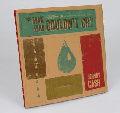
Example 05: Scotty Reifsnyder 'The Man Who Couldn't Cry'
This last example is very interesting as it details such an intriguing list of final outcomes/products. Scotty Reifsnyder took a simple subject matter ; Johnny Cash's 'The Man Who Couldn't Cry' song, and turned it into two wholly separate but both effective outcomes. The first thing he did was create an animation. Now I know what I have said in the past, and that I promised I would never work with aftereffects or moving image again as it is too stressful, however after watching this video I have had my faith restored. It is the type of animation that doesn't seem so challenging and with the right assets works incredibly well. The second outcome for this project was to take the illustrations and turn the concept into a childrens book. I really like this as it again combines pop culture references with a unique solution, my ideal approach.


No comments:
Post a Comment