
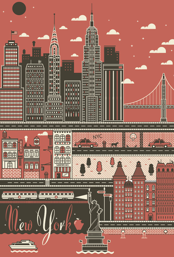


I found these works and was reminded of a post I did a while back. I think they are very similar to Anthony Burril's work in style and composition. These are slightly less minimal and have greater detail but all in all they're pretty similar. Out of the two I would have to say I prefer these, probably because of the more sullen tones, they're not vibrant and brash but subtle and calming. I also like the way the three cities are depicted, with their cultures being intertwined with the design. The inclusion of the type at the moment adds a nice touch, but I honestly think it's not needed. What with the depiction of famous landmarks in the illustration, it's pretty obvious what is being shown.
No comments:
Post a Comment